How can we create a reassuring but non-
intrusive experience for outdoor sports?
the project
Our client approached us for the design and development of a mobile app that pairs with a physical location tracking device, a product used for outdoor sports that would aid in finding people lost in woods and mountains. I lead a team of four through a modified Agile/Scrum process, planning and executing our weekly sprints that each ended in a face-to-face meeting with the client! Our timeline included phases for research and discovery, branding, ux wireframes, high fidelity design, and the development of the TrailTag mobile app.
Check out the full prototype on InVision here!
research & discovery
Given the huge scope presented by
the client and the fact that we were the most unathletic team of designers and devs, we decided to extend our standard research
phase! During this time we sought to better understand the target demographic and varying factors, safety risks, and experiences across a
wide range of extreme sports (did you know heli-skiing even existed? I didn't!) through user surveys and user interviews.
After these three weeks, we realized we needed to narrow TrailTag's scope from a mobile app that targets all use
cases across all extreme outdoor sports, to a more narrowed experience that applies to a subset of outdoor sports for a better user experience in their MVP. We decided to focus on moutain-based group sports
like hiking, camping, and skiing.
creating a ux system
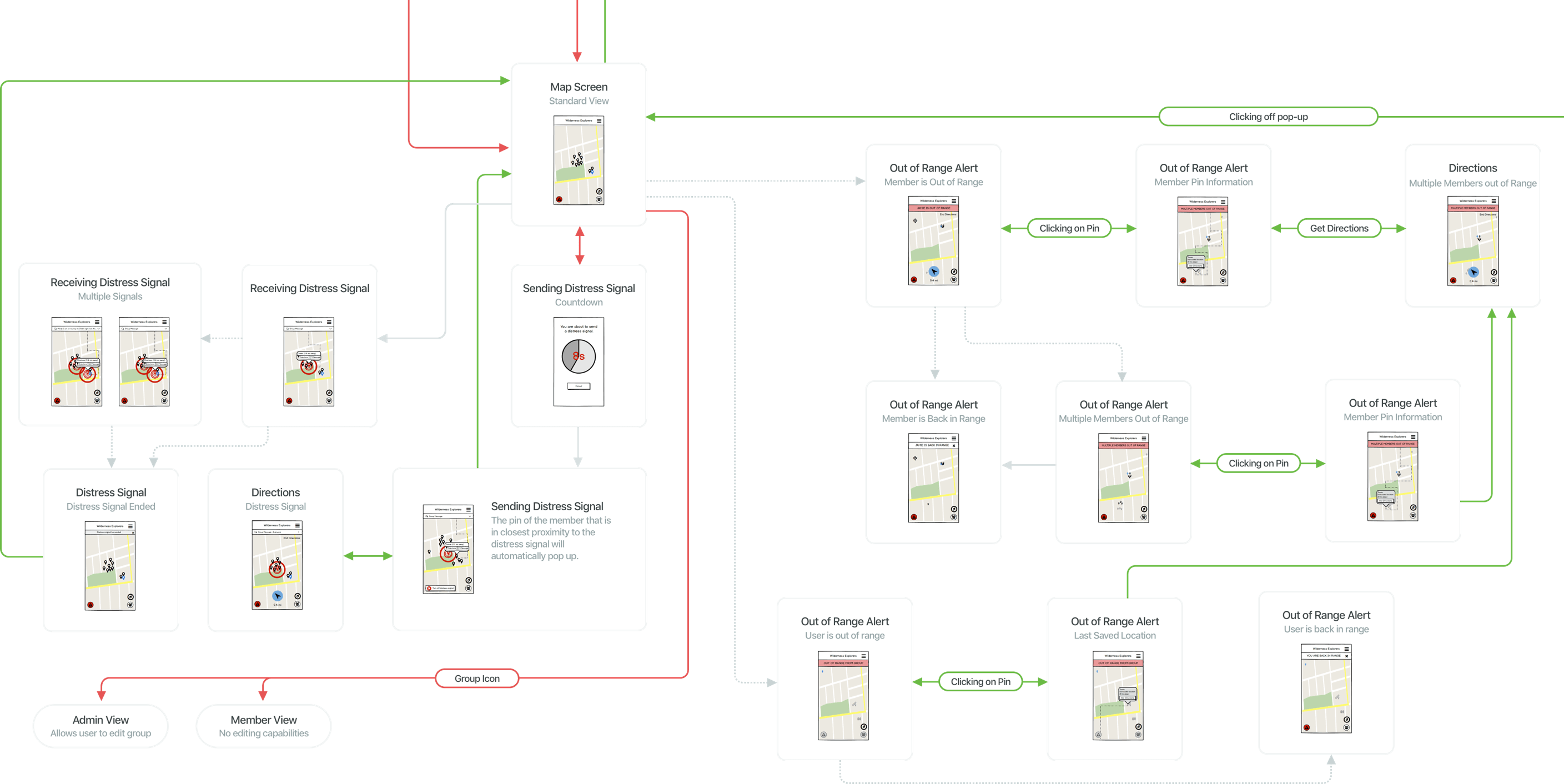
Our first weeks of wireframing were all-hands-on-deck as we mapped out, flow-by-flow, each corner of the TrailTag app. We realized quickly how large our UX system would be, given the sheer amount of the overlapping states the app would need to have. States like a member in a group vs. not-yet-joined-a-group, regular use state vs. emergency state, emergency state for the one who sent the distress signal vs. users receiving the distress signal, out-of-range users, etc: and all of these divided further into admin view vs. regular user states. Plus you could download maps!
We used paper wireframes (pencils + scissors + little ui puzzle pieces) to collaboratively piece together full flows. Once we were all in agreement on the best flow to pursue, we digitized our paper wireframes using Balsamiq and loaded them into an InVision prototype to present to our client at each weekly meeting. Along the way, we realized that Balsamiq's limitations as a program made the rapid iteration and duplication of all of our overlapping flows a difficult task to accomplish, and retrospectively we agreed that we would have rather used a Sketch file to create low-fi mockups if we had to start all over again!
Check out a map of our entire UX system here!
creating a visual system
Because our app would be used by people in a variety of outdoor situations, our interface had to be as easy as possible for people to use under fast-paced and limiting circumstances. For that reason, one of our main focuses when approaching high fidelity mockups was creating a consistent color and visual system that relayed the most important information to users upon first glance.
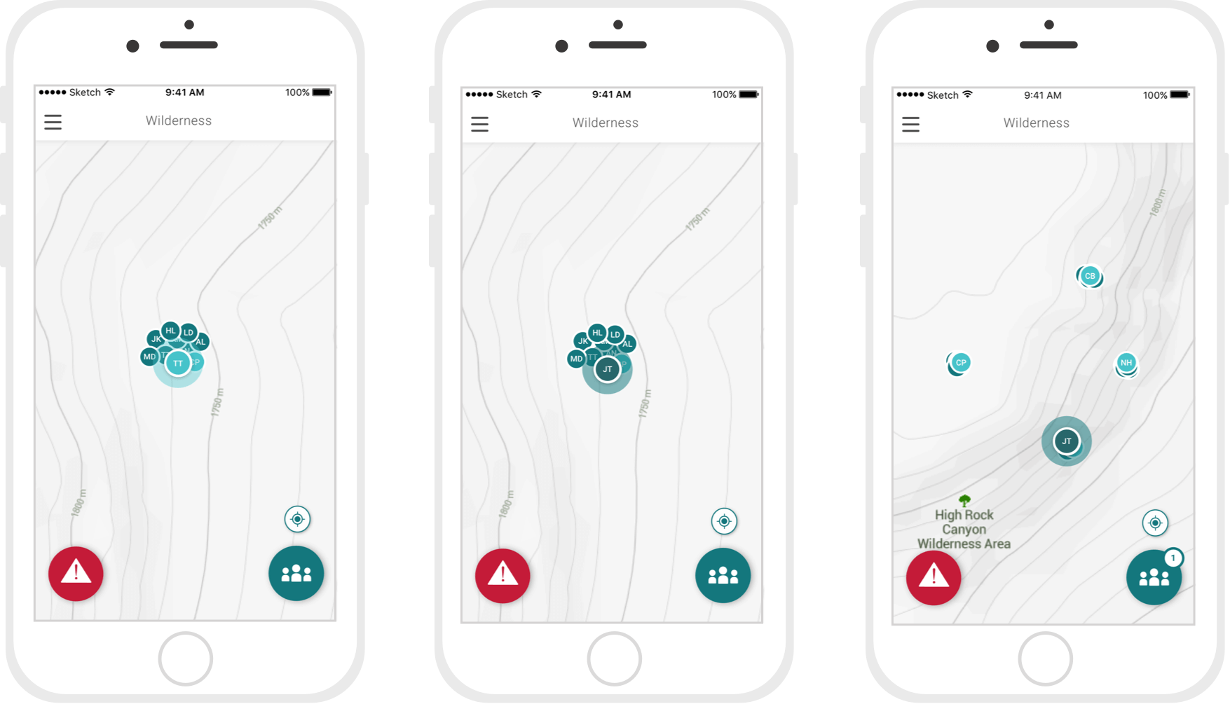
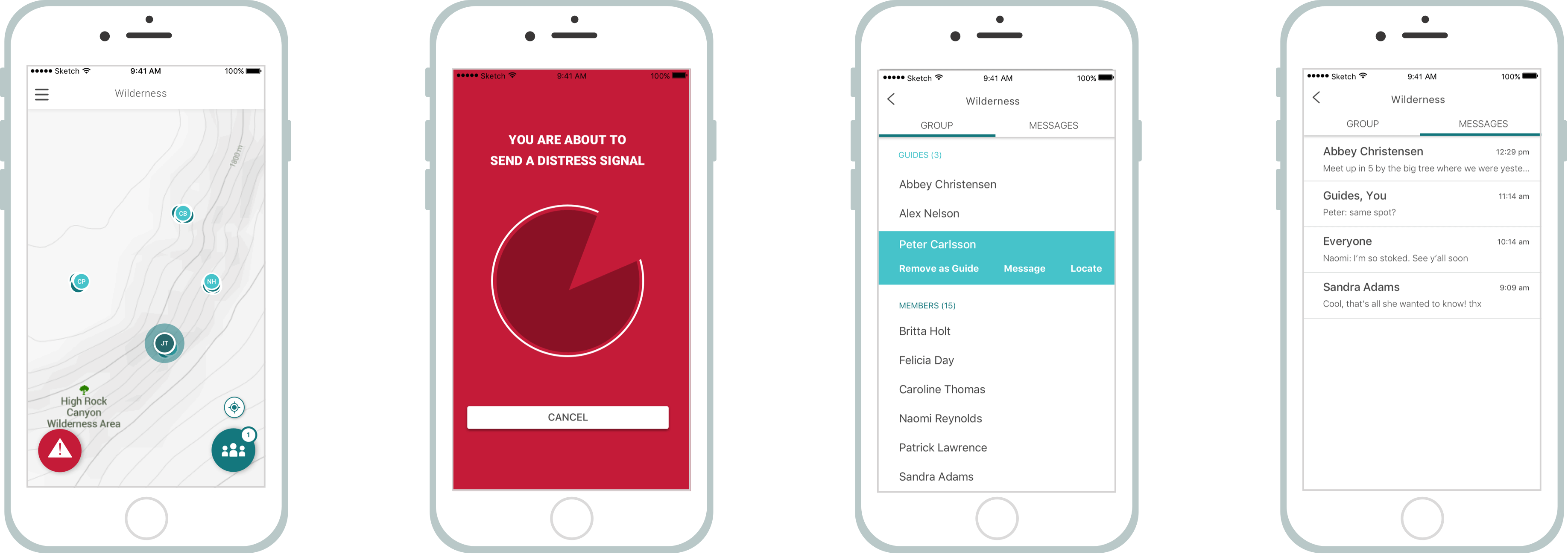
USERS ON THE MAP: Guides vs. Non-Guides
One primary peice of information users would want to know at first glance is who are the guides, and where are they? To indicate this easily, guide markers and associated elements are light blue, while non-guide markers and associated elements are TrailTag teal. For ease of quickly recognizing your own marker on the map, that marker is visually bigger than the others surrounding it.
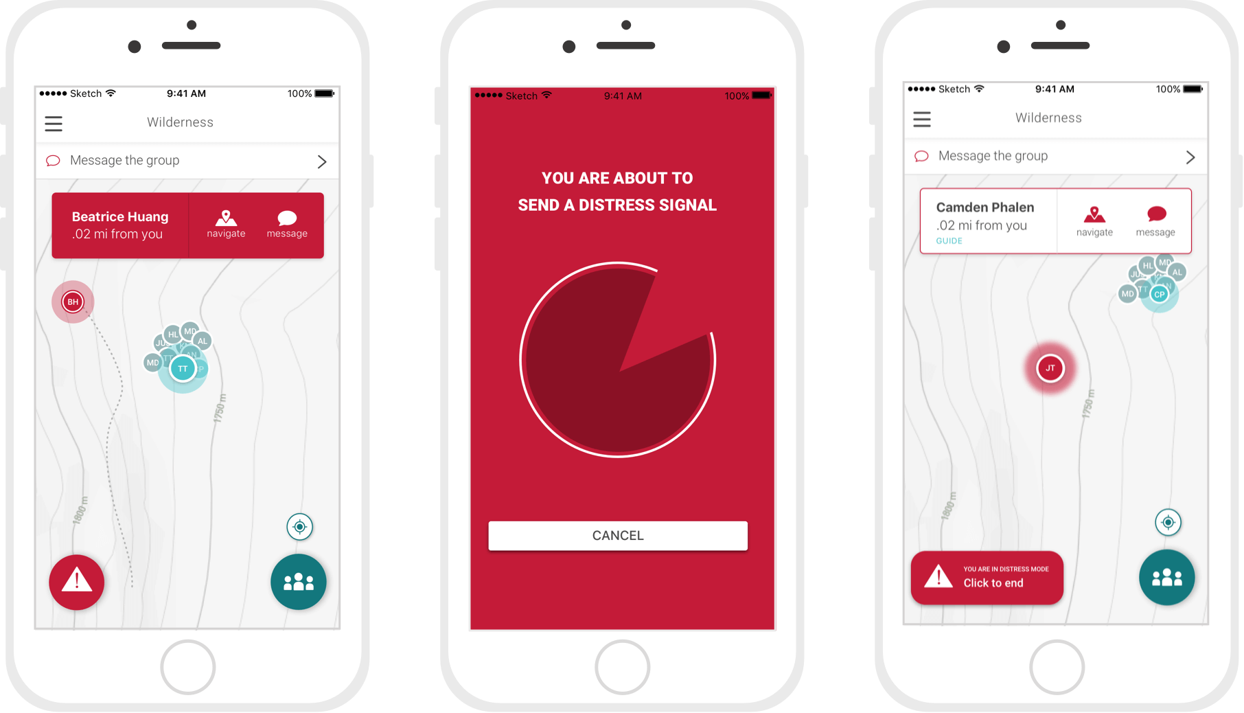
DISTRESS MODE
The next color code we introduced into the app signifies distress, whether you are the one in distress or a member of your group is. The distress color is red, which we believed to be the most direct and universal. The markers and associated secondary elements of user's in distress appear red. Red is incorporated into the secondary elements of other user's when you yourself are in Distress Mode.
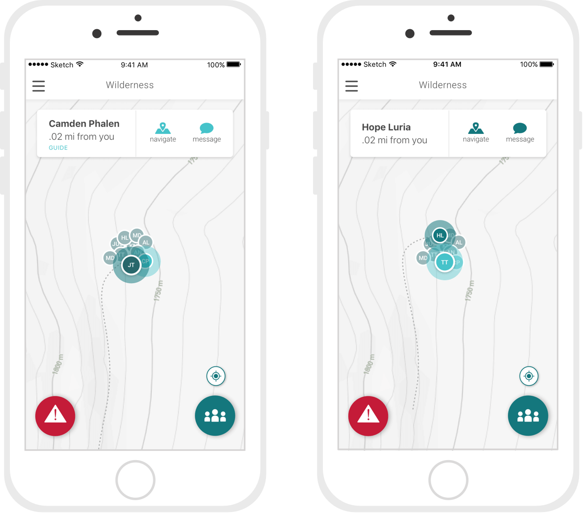
SECONDARY USER INFO: Full Name and options
Secondary information on the map appears after tapping on a someone's marker: a popup appears with the user's full name, their approximate distance from you, and two options that allow you to navigate towards or message the user selected. You can also swipe the the popup to swipe through the rest of the members whose markers are currently visible on your page. A glowing ring appears around the marker of the user who's popup is being displayed.
creating a
navigation system
Another major focus in our high-fi mockups was the navigation we presented users. Based on inspiration from Material design, we decided to create a two-button primary navigation system with a hamburger menu for less important actions. Our first button was a given: we needed to give users the fastest, most obvious way to send a distress signal to the rest of their group with minimal motion/interaction. We implemented a one-touch emergency signal flow: if the user presses the button, the signal is delayed 10 seconds so that the user is able to cancel it (if they pressed it by mistake), but it remains a one-click process for those in distress as the signal automatically sends after 10 seconds if not cancelled.
The second button on the screen gives users access to the group details and messaging component of the TrailTag app. It consists of two parts: the first screen, which is a list of every member in your group that can be used to navigate towards those members on the map. The second screen is a messages feature that works without a cell signal via the bluetooth connection of the TrailTag devices.
The hamburger menu includes all secondary navigation of the app that varies slightly for guides vs. non-guides, including logout, leave group, edit settings, etc.
next