How can we recreate the feeling of walking down Newbury with friends in a mobile app?
research & discovery
Our clients approached us with a concept in mind: they wanted to create a mobile app experience that made users feel as though they were walking down Newbury with their friends, but with the comfort and ease that shopping online provides. With this in mind, we dove head first into conducting user surveys, compiling resources and research into the shopping experience, doing branding exercises with the client, and just wrapping our heads around what Zealery could be.
Our team of five followed an Agile/scrum process, modified for an extended research phase that ran concurrently with our branding phase.
creating wireframes
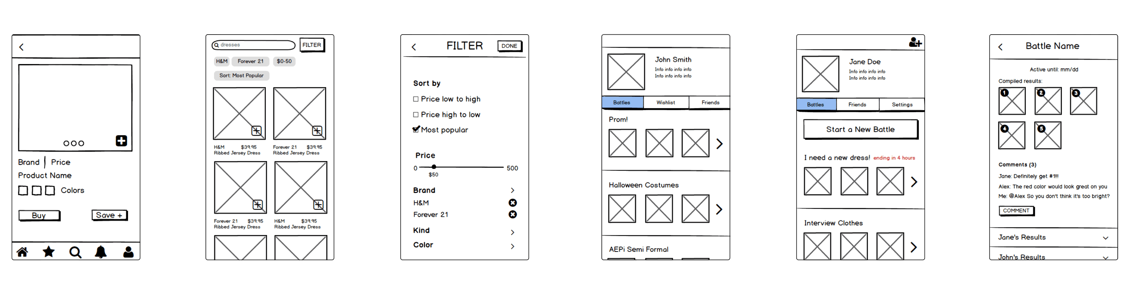
With three people working on wireframing, our team quickly discovered that the best way for all of us to make UX decisions together was puzzle piecing together paper wireframes, screen by screen. Not only was it super fun to play with little paper buttons and drop down menus, but collaboration became so much more efficient when we were able to have open discussions as we moved around pieces to compare different solutions.
During this low-fi wireframe phase, we would have paper wireframing sessions mid-sprint and then translate our wireframes to digital screens using Balsamiq. This prototyping program allowed all of our wireframes to look like they belonged to one cohesive system before any hi-fi design system was applied. Balsamiq provided the added bonus of really forcing us to ignore styling and focus only on the experience due to their not so pretty ui elements!
applying styles
to wireframes
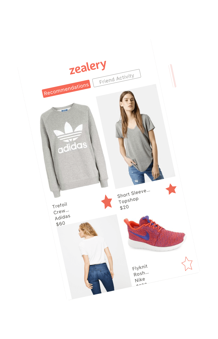
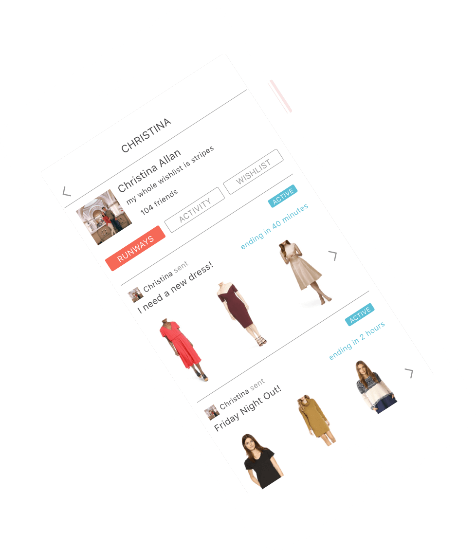
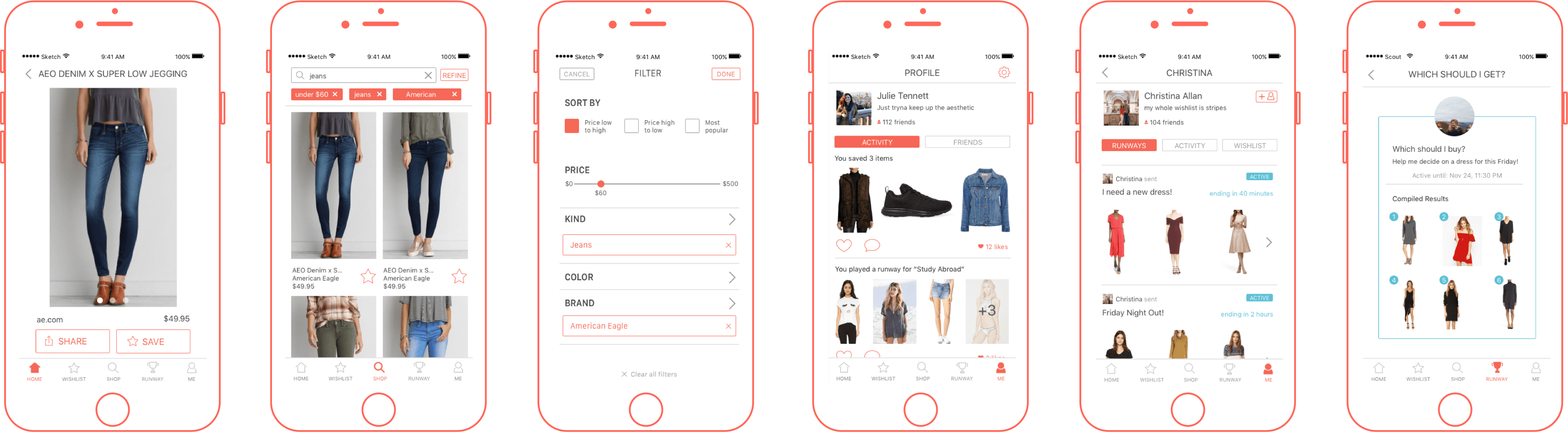
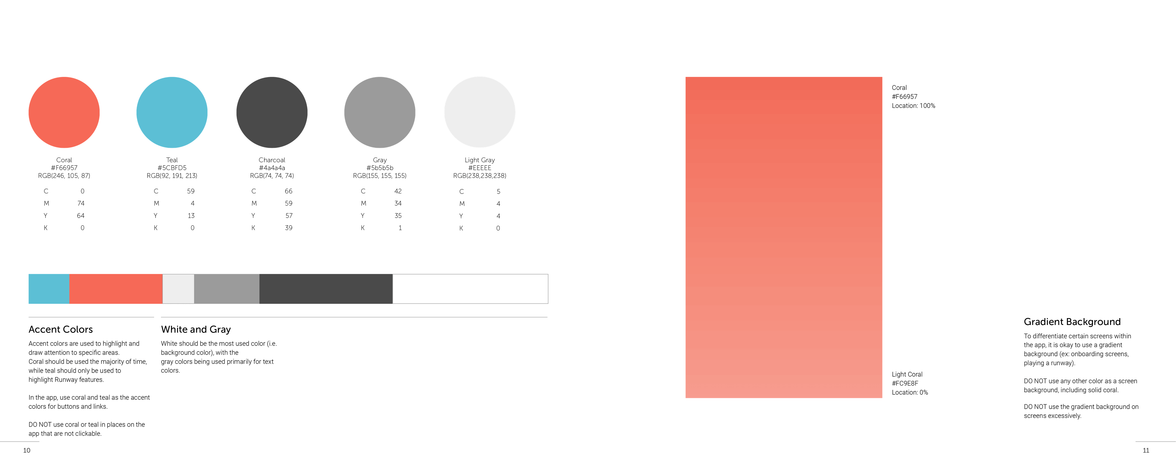
Once we moved into the high fidelity stage of prototyping, we were able to develop style guidelines together based on the branding decisions made earlier in the semester. We created a clean look for the app, leaving a lot of white space and using Zealery's coral color only as a highlight where necessary. The layout is smart and easy to use, while the coral adds the pop of friendliness vital to Zealery's brand.
I took on the task of designing all of Zealery's icons in their selected and non-selected states. I loved being able to create icons that felt unique to Zealery while still adhering to iconography that users can recognize easily. All of Zealery's icons are based on lines, with soft edges that feel friendlier than sharp corners.
Check out the full prototype on InVision here!
creating brand guidelines
I had the opportunity to collaborate with my design lead to put together Zealery's brand guidelines, a book printed out and given to our client as one of our final deliverables. The book details how to properly apply and use Zealery's brand element, how to understand and use the UI/UX system we made them, how to create more icons in the same style of Zealery's existing set, and the development details for laying out the different ways photos are displayed on the app.
previous